From the draft archives. This is a post I started over ten years ago but never got around to finishing. It discusses my reaction to someone telling me the web was dead and that mobile was taking over. Their argument was that apps would replace websites. I disagreed. I have left the majority untouched, cleaning up the language a bit. I left some final thoughts at the end.

Someone told me recent that the web is dead and that the future is mobile. What they really meant was that browsing the web with a traditional web browser is dead. But they’re wrong, all that has really happened is that mobile devices have just now become viable options for accessing the vast amount of information and resources available on the Internet. The web isn’t dead, mobile devices just don’t suck anymore.

Thanks to the iPhone there has been a major shift in how people think about the web and how mobile devices fit in. The mobile web experience is no longer limited to a simple list of links and no images. It’s fuller and more capable. It’s rich with images, audio and even video. People care about ensuring their information is fully accessible to people on the go and looks great while using small devices. And if a site can’t be massaged to work with the iPhone then a specialized app can be created to ensure the end user has a great experience.

Of course, Apple is no longer the only vendor out there trying to create a great end user experience. The most notable competitor to iPhone is nearly any Android based phone. Android is incredibly young as far as mobile OSs go but already it’s a worthy competitor to Apple’s iOS. Either device is capable of providing a full web experience.

Mobile devices won’t replace the web experience we all know today. They simply extend it. They are extensions to our desktop computers, devices we can use while on the go to keep up on all of the information available to us. The key is to ensure that end users are able to access the information they want in a convenient manner. If that means creating a template for your site or even creating a specific app.

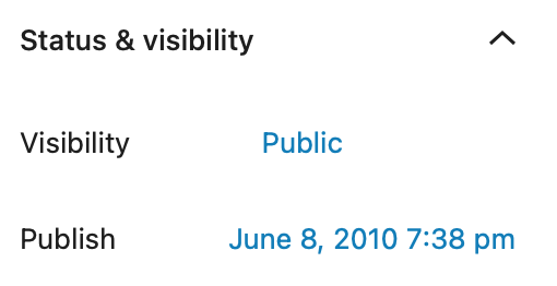
My original post from June 8, 2010

While I don’t believe (and continue to not to believe in 2020) mobile devices will completely replace computers, I do think they will become the primary device for a lot of people.

Seth Weintraub writing for CNNMoney.com wonders if Steve Jobs distorted the truth during his iPad 2 announcement.  He starts by trying to examine Job’s “First dual core tablet to ship in volume” comment.

“First dual core tablet to ship in volume.” That’s funny, I tested a Dell (DELL) Streak 7, which had a dual core Nvidia Tegra 2 chip in January. They’ve been shipping ever since on T-Mobile.

In volume.

Of course, the Motorola (MMI) XOOM also has this same dual core processor and is certainly shipping in volume as well. In fact, I’ve been using an Android phone (the Atrix) with a dual core chip for weeks and it wasn’t the first to ship in volume.  As for Apple (AAPL), they haven’t shipped one iPad 2 yet — iPad 2’s hit shelves on March 11.

Seth isn’t the only one to latch onto this quote and try to debunk it but what a lot of people are failing to realize is that, while others may be shipping dual-core tablets, it’s very safe for Steve Jobs to say that Apple will ship and sell a higher volume of iPad 2’s than any other dual-core tablet available today simply based on sales of the first iPad.  Indeed, if previous iPad sales are any indication at all, iPad 2 is going to be a huge hit. What other tablet device can claim that today?

And to say that Apple hasn’t shipped any iPads is completely naive.  Apple has a stock pile of second generation either en-route to stores or in stores already.  This is very common for any product.

Seth also tries to pick apart Jobs’ “>90% market share” bullet point.

Apple would have needed to sell 3.2 million more to reach 90% of 2010’s tablet market share against just Samsung alone (in triple the time).  That’s not including all of the Android-powered Nooks out there, those cheap $100 Androids you can buy at Walgreens or Amazon and even Windows-powered Tablet PCs (which are mentioned two bullet points above!).  If you choose to include the Kindle, Apple may not have even reached 50% of the market.

While he might have a point about the actual market share number his supporting arguments are just ridiculous.  First, the sales of “cheap $100 Androids” don’t even register, to the point where nobody is actually tracking them.  Second, there is no such thing as a Windows powered Tablet PC when you consider how tablets have come to be defined because of the iPad.  Nobody is selling a Windows powered tablet.  And last, attempting to bring in Kindle sales simply doesn’t make sense as the Kindle is a reading device, not a general purpose tablet device.  Talk about skewing data in your favor.  “Pot, meet kettle.”

Seth goes on to point out hardware specs and pricing.

Perhaps Jobs could have also compared the iPad 2 to other Android tablets’ prices? Samsung’s Galaxy Tab and Dell’s Streak both now start at $499 and have better cameras, 3G radios and GPS, which seem to compete well with Apple’s $499 Wifi-only offering.  Reality distorted.

Know why the Tab and the Streak both now start at $499?  Because they’re not selling.

But hey the XOOM has better specs right?

But then consider that the XOOM has a much better, bigger 720P+ screen compared to the iPad’s 1024×768 job (it has less Retina™).

Where Seth wants to pick on Jobs’ use of the word “volume” saying it is subjective, so to is saying the XOOM’s screen is “much better.”  The iPad’s screen is an IPS panel giving it a much wider viewing angle where as the XOOM does not.  While it is true that the XOOM has a 720p display Seth, like so many other reviewers and Apple nay-sayers, fails to realize is that the iPad’s 4:3 format display makes much more sense than a 16:9 display format.  By giving a tablet a 16:9 display format you’ve essentially limited the device to a horizontal layout.  The iPads 4:3 format allows developers to create apps that favor either layout and still get good use from it.  Remember, the iPad is a general purpose device, not just some common movie player.

The only thing Seth got right in his troll piece is that Jobs misquoted Samsung’s CEO.

Linux News is reporting that Acer will be launching two new Android tablets, both a 7″ and 10.1″ model, as well as a Windows 7 based tablet. I asked the magic 8 ball and it is already saying “outlook not so good.” Even the “experts” who cover this stuff already know that whatever Acer pumps out simply won’t match the iPad.

“The price point is the only way for other tablets to compete against the iPad for now, as it’s very difficult to battle the iPad in terms of the user experience,” Kitagawa explained. “But if the price is lower than the iPad’s, and the user experience is good enough, buyers might be attracted.”

That’s not exactly praise being dished out there now it is?

I’d really like to see more companies compete with the iPad by actually offering a compelling product. Samsung’s Tab is so far about the only Android based offering that even stands a chance but even that tablet comes up short. It kinda reminds me of a certain Dilbert cartoon

Dilbert.com

And we all know how I feel about Windows 7 on a tablet. That has #fail all over it.

Lets get something out in the open. I’m really picky, particularly with consumer electronics. I expect something to work as advertised, intuitively, smoothly and without crashing. I’ll quickly dismiss a device over things others will quickly get over. The Western Digital TV Live Media Player is one such device that got great reviews that I simply couldn’t stand. It was advertised as a product that could play virtually any file format either through an attached USB device or through a network connection. What I found was it “could” do some of those things but only some of the time. It repeatedly crashed, treated the same file different based only on the file extension and in the end, the product was a nightmare to own and I quickly sold it.

So anyway, lets talk about Android. Recently the on call phone that is passed around between myself and two of my co-workers was replaced by a Droid2 (which I pushed for). The Droid2’s hardware is top notch. It has a high quality feel to it and a great, to my eyes, screen. I haven’t had much time with the camera so I really can’t say much about it.

Android on the other hand is a mixed bag and as my co-workers pointed out today, this is where my picky tendencies just get out of control. I find many parts of the Android OS to look fantastic, especially when not in motion, and have a polished feel, while other parts just feel half-assed. For example, waking the Droid2 from sleep quickly fades the screen into view which looks very elegant. You are then offered two basic options using the same motion, just in different directions. Pull the tab on the left to the right and you unlock the phone. Pull the tab on the right to the left and you toggle between vibrate only mode or sounds on. These are great except the animation of either tab looks rather poor. Once the phone is unlocked, the lock screen fades away to reveal the default interface, which again looks great and is very smooth. This disparity between how the screen fades so smoothly and poor unlock animation breaks the continuity of the experience. The two bits feel like different parts when they should feel as if they’re all one part melded together.

As a long time iOS user, if there is such a thing, there are other parts to the Android experience that really stick out. One of them is text input. So far, I have yet to find a text entry box that brings up the keyboard by default. For example, open the Gmail app and compose a new message. The keyboard won’t show unless you tap the To: field even though the To: field is focused by default. Another example. Add the Android News and Weather widget by doing a tap and hold on the a screen. Once added, attempt to manually add a location. You will be faced with an all black screen with a single text entry field that has focus and a magnifying glass to the right of it. There will be no keyboard even though clearly this is the only text box and the only thing to do on that form is enter text. Touching the already focused text box will cause the keyboard to appear allowing you to enter text. If you then click the done button on the keyboard the keyboard goes away and then nothing happens. You have to click the little search icon instead. I find this incredibly irritating.

Another surprisingly jarring thing is that list views aren’t able to scroll past either ends. The ability for a list view to scroll slightly past the top or bottom of the list provides a visual cue that you’ve reached the top or bottom of a list of items. On Android, the scrolling simply stops but you don’t always know that it has stopped because it is out of items or because it isn’t registering that you want it to scroll. In other cases where the entire list contains just enough items to fill the whole screen, you again can’t really tell if it isn’t scrolling because there are no additional items, or if the screen isn’t meant to scroll or if the hardware isn’t “getting” your gesture.

Speaking of scrolling. Android’s response to touch is great except for initiating a scroll, either up and down or left and right. It seems to take almost twice as much distance for Android compared to iOS to realize you want to scroll a list view or move between screens. Once Android begins scrolling, the animation looks poor and full of judder. Again, this distracts from an otherwise pleasant experience.

All that said, this phone is far superior to the previous phone that was Windows Mobile based. Windows Mobile wasn’t great then and compared to what is available today was positively atrocious. I think Android has come a long way in a short amount of time and I hope Android can close the experience gap with iOS in future releases. Until then, I consider Android versus iOS to be like Windows 7 vs OS X. While I prefer iOS or OS X, having to use Android or Windows 7 isn’t a step backwards, it’s just a different way of doing things.