macOS Big Sur is set to change a lot about how the interface looks by, primarily, bringing in a lot of elements from iOS. Some changes include updates to notification windows, the inclusion of Control Center into the menu bar and an overall unification of the design language used for app icons and the dock. App icons now sport the same rounded square look that iOS has used for years and the dock itself is very similar to what you see on iPad. The changes help freshen up the look of macOS and bring a sort of familiarity and consistency that didn’t exist before between the two operating systems. Like a certain rug, it really ties things together.
Other changes, however, feel really off or don’t come across as well and I’m holding out hope that future iterations of the beta will adjust these items or even revert to the previous design before we see the full release of Big Sur.
Lets start with the menu bar:

The new menu bar design is now almost entirely transparent. Because of the transparency, the chosen background comes through loud and clear. So much so that dark backgrounds will make the traditionally black lettering of the menu bar impossible to see. To combat this, the text is rendered in white when the background crosses some threshold so that the text remains legible regardless if the background.
This has a couple of undesirable side effects.
For starters, the new design completely ignores your light versus dark mode preference. Got a dark background? Your menu bar now appears as if you’ve selected dark mode even though the rest of your display is set to light. Of course, the opposite applies if you pick a light background but prefer dark mode. While it possible to disable the transparency by selecting “Reduced transparency” in the Accessibility options the option also affects the otherwise excellent looking dock.
Less serious an issue, the lack of any delineation between where your apps live and where the menu bar starts creates a general sense of awkwardness where you just have this floating text. In the previous (and long-standing) design the menu bar was an obvious feature of the overall desktop. Now, it’s just some floating stuff that doesn’t match my light versus dark mode preference.
Jumping over to Notification Center we’re greeted with additional changes. To be honest, it’s not immediately clear to me why notifications are changing as they’ve been nearly perfect in the past two revisions of the OS. The changes don’t really feel in any way connected to their iOS counterparts and how could they be made to be when macOS lacks the contextual swipe options that iOS has? Anyway, the changes really feel like change for the sake of change and they offer horrible UX for the end-user.
Take the following screenshot taken when the mouse is over the notification:

When the mouse is over the notification you get additional ways to interact with it. This is similar to previous versions of macOS except now some of your options are hidden away in a small submenu. This small submenu, unlike the previous buttons, is much more difficult to interact with quickly. In the previous design, the right side of the notification was split into two parts that were easy to hit with the mouse with little though. The new design requires a bit more finesse in order to hit the intended target. Not impossible, of course, but something that can take you out of “the zone” and gets annoying if you interact with notifications often. The little menu also interferes with the text of the notification in a way that feels sloppy.
The operating system itself is not the only thing seeing changes to look more like iOS. Many, if not all, of the core Apple apps are also receiving modifications to make the apps look more like they might if they were on iOS. Safari and Mail, for example, both look much more like their iOS counterparts than ever before. All of them also lost nearly all contrast making everything blend together. This makes some tasks that were once easy, like determining which tab was active in Safari, nearly impossible without really paying attention:

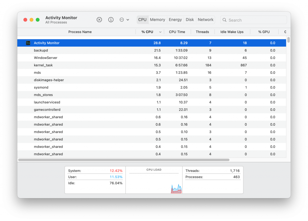
Activity monitor just never looks like anything is active, that everything is either not available or somehow not active at all:

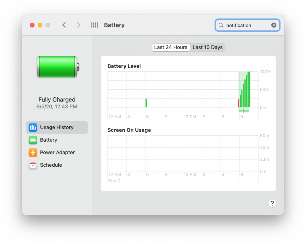
Especially when compared to the battery preferences window:

It’s entirely fair to say that Big Sur is still in beta and a lot of this could still change before to the full release. I sincerely hope that changes do happen to at least the elements I’ve featured here as they are the most glaring items I’ve seen so far. They are also items you interact with on a daily basis so they have to be right. Apple has always been about sweating the details and nailing the user experience. It is a huge reason I’ve been running macOS since they switched to the Intel platform years ago but Big Sur really feels like a step in the wrong direction. There are a lot of things to like about Big Sur but they can easily be negated by missing the mark on the bits we interact with the most.