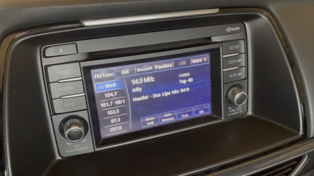
Photo of the stock Mazda radio

I have driven a 2015 Mazda 6 Touring with the non-Bose stereo since it was new and the number one complaint I have had is the stock radio. Mazda only offered this style of deck in the 2014 and 2015 model year 6 and then replaced it with a better, more capable unit in 2016. To say this deck is bad is an understatement. The only redeeming quality of this deck is that it is a double din sized unit that can be replaced at all. Even at the time of release this deck was a bit behind on technology including support for Pandora, iPod and USB sticks with music. Everything other than the CD player and FM/AM radio was very poorly implemented. iPods were already almost entirely replaced by smart phones at time of release yet it could rarely actually load music from an iPod or an iPhone running Music.app. Reading music from a USB took ages and browsing the music cumbersome, not to mention who wants to manage music on a USB stick? Pandora? I don’t know anyone who uses it. The CD player did work but showed the bare minimum information on the screen. Contrast this to my wife’s Toyota van which could often show cover art and just looked much more slick overall.

It would have been ok if the bluetooth implementation wasn’t riddled with bugs and annoyances. Starting the car and waiting for bluetooth to connect to your phone took minutes, sometimes several. Once it did connect, it would often fail to play music properly by either refusing to do anything or acting like it was playing but lacking any audio. If you were on a call when you started the car you would be presented with a crash/boot loop where the car would take over the call, crash sending the call back to your phone only to steal it away again when it started. This would loop forever until you ended the call. Once it was playing music it couldn’t tell you what track number you were on or the amount of time spent playing. The track number was something random and the timer always sat at 0:00. Moving between tracks was glacial with at least a second spent waiting for the song to change, including the title shown on the display. Overall the experience was subpar in every way.

All that said, I felt trapped into keeping the deck because it was responsible for controlling some configuration settings of the car including daytime running lights, door locking behavior and more. I had basically given up all hope of replacing it because I didn’t want to create new issues or lose steering wheel controls.

It wasn’t until 2024 that I learned there are devices that allow you to better integrate aftermarket decks with modern cars allowing you to keep your steering wheel controls and continue to access vehicle settings. I decided it was time to finally replace the stock deck. In this post I will detail what products I used to replace the stock radio in my 2015 Mazda 6 and what I learned throughout the installation process.

Continue reading

Do a Google search for “2018 mac mini bluetooth issues” and you’ll get a lot of hits. The Bluetooth issues with the 2018 Mac mini are well documented. What isn’t as well documented is how to work around the issue. I say work around because I have yet to find a proper solution to the issue.

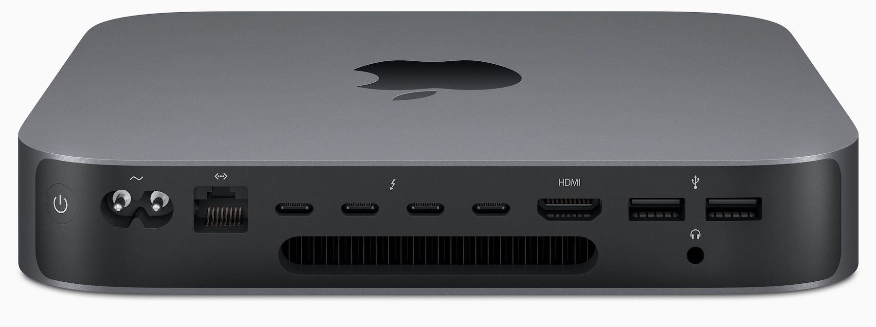
To be fair, the issue isn’t unique to the Mac mini itself. The system just seems to suffer from it more easily than others. As it turns out, USB 3 will cause interference in the 2.4-2.5Ghz frequencies. This is the same frequency that Bluetooth operates.

Let’s take a look at how the issue manifests itself. If you are using Bluetooth devices like a wireless mouse, keyboard, AirPods or any combination thereof and you are using the type A USB 3 ports on the back of the system, you will most likely experience periods of missed keystrokes, poor mouse tracking or stuttering audio.

To work around the issue I found a few references in my Google searches referencing the USB 3 ports. As it turns out, not using the USB 3 ports really is the key to avoiding the issue. Instead, get yourself a USB-C based hub that features USB 3 ports or simply an adapter to convert USB-C to type A USB 3 connector. With this in place, I have eliminated all of the connectivity issues I had been having.

This is an unfortunate hack that removes an otherwise useful feature of the Mac mini. While you can still get full speed using a USB-C adapter it would be better if you didn’t have to lose functionality or ports in order to work around what is an unfortunate coincidence between USB 3 and Bluetooth. There are potentially other ways to solve this using properly shielded cables or ferrite cores. I’d like to test these options in the future and if I do I’ll try to report my findings.

macOS Big Sur is set to change a lot about how the interface looks by, primarily, bringing in a lot of elements from iOS. Some changes include updates to notification windows, the inclusion of Control Center into the menu bar and an overall unification of the design language used for app icons and the dock. App icons now sport the same rounded square look that iOS has used for years and the dock itself is very similar to what you see on iPad. The changes help freshen up the look of macOS and bring a sort of familiarity and consistency that didn’t exist before between the two operating systems. Like a certain rug, it really ties things together.

Other changes, however, feel really off or don’t come across as well and I’m holding out hope that future iterations of the beta will adjust these items or even revert to the previous design before we see the full release of Big Sur.

Lets start with the menu bar:

The new menu bar design is now almost entirely transparent. Because of the transparency, the chosen background comes through loud and clear. So much so that dark backgrounds will make the traditionally black lettering of the menu bar impossible to see. To combat this, the text is rendered in white when the background crosses some threshold so that the text remains legible regardless if the background.

This has a couple of undesirable side effects.

For starters, the new design completely ignores your light versus dark mode preference. Got a dark background? Your menu bar now appears as if you’ve selected dark mode even though the rest of your display is set to light. Of course, the opposite applies if you pick a light background but prefer dark mode. While it possible to disable the transparency by selecting “Reduced transparency” in the Accessibility options the option also affects the otherwise excellent looking dock.

Less serious an issue, the lack of any delineation between where your apps live and where the menu bar starts creates a general sense of awkwardness where you just have this floating text. In the previous (and long-standing) design the menu bar was an obvious feature of the overall desktop. Now, it’s just some floating stuff that doesn’t match my light versus dark mode preference.

Jumping over to Notification Center we’re greeted with additional changes. To be honest, it’s not immediately clear to me why notifications are changing as they’ve been nearly perfect in the past two revisions of the OS. The changes don’t really feel in any way connected to their iOS counterparts and how could they be made to be when macOS lacks the contextual swipe options that iOS has? Anyway, the changes really feel like change for the sake of change and they offer horrible UX for the end-user.

Take the following screenshot taken when the mouse is over the notification:

When the mouse is over the notification you get additional ways to interact with it. This is similar to previous versions of macOS except now some of your options are hidden away in a small submenu. This small submenu, unlike the previous buttons, is much more difficult to interact with quickly. In the previous design, the right side of the notification was split into two parts that were easy to hit with the mouse with little though. The new design requires a bit more finesse in order to hit the intended target. Not impossible, of course, but something that can take you out of “the zone” and gets annoying if you interact with notifications often. The little menu also interferes with the text of the notification in a way that feels sloppy.

The operating system itself is not the only thing seeing changes to look more like iOS. Many, if not all, of the core Apple apps are also receiving modifications to make the apps look more like they might if they were on iOS. Safari and Mail, for example, both look much more like their iOS counterparts than ever before. All of them also lost nearly all contrast making everything blend together. This makes some tasks that were once easy, like determining which tab was active in Safari, nearly impossible without really paying attention:

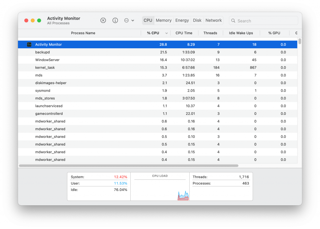
Activity monitor just never looks like anything is active, that everything is either not available or somehow not active at all:

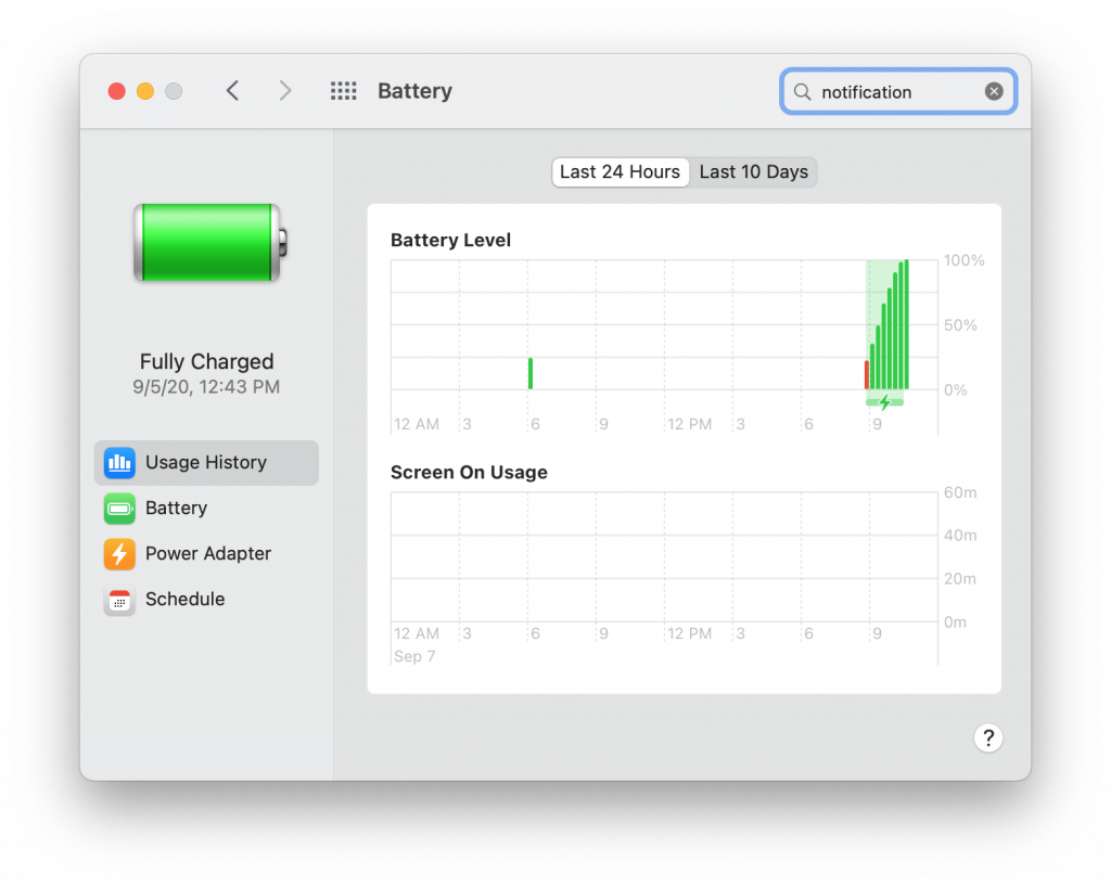
Especially when compared to the battery preferences window:

It’s entirely fair to say that Big Sur is still in beta and a lot of this could still change before to the full release. I sincerely hope that changes do happen to at least the elements I’ve featured here as they are the most glaring items I’ve seen so far. They are also items you interact with on a daily basis so they have to be right. Apple has always been about sweating the details and nailing the user experience. It is a huge reason I’ve been running macOS since they switched to the Intel platform years ago but Big Sur really feels like a step in the wrong direction. There are a lot of things to like about Big Sur but they can easily be negated by missing the mark on the bits we interact with the most.

Whatever your use case may be, it is possible on at least macOS 10.15+ to modify the number of CPU cores that are currently online or available in realtime. The available CPU core count can be modified using a utility called cpuctl.

To get a list of currently active CPU cores issue sudo cpuctl list. This will output which cores are currently active. Here is the output on my two core, four thread MBP:

sudo cpuctl list
Password:
CPU0: online type=7,8 master=1
CPU1: online type=7,8 master=0
CPU2: online type=7,8 master=0
CPU3: online type=7,8 master=0

To limit core count to just two issue sudo cpuctl offline 2 3. Now a list will show the following:

CPU0: online type=7,8 master=1
CPU1: online type=7,8 master=0
CPU2: offline type=7,8 master=0
CPU3: offline type=7,8 master=0

To bring them back online a simple online operation can be done – sudo cpuctl online 2 3. Now the listing has returned the normal:

CPU0: online type=7,8 master=1
CPU1: online type=7,8 master=0
CPU2: online type=7,8 master=0
CPU3: online type=7,8 master=0

Keep in mind you should not offline the CPU marked as “master”, doing so will cause your system to become unresponsive even if you leave others running.

For detailed information take a look at the man page for it (man cpuctl).

From the draft archives. This is a post I started over ten years ago but never got around to finishing. It discusses my reaction to someone telling me the web was dead and that mobile was taking over. Their argument was that apps would replace websites. I disagreed. I have left the majority untouched, cleaning up the language a bit. I left some final thoughts at the end.

Someone told me recent that the web is dead and that the future is mobile. What they really meant was that browsing the web with a traditional web browser is dead. But they’re wrong, all that has really happened is that mobile devices have just now become viable options for accessing the vast amount of information and resources available on the Internet. The web isn’t dead, mobile devices just don’t suck anymore.

Thanks to the iPhone there has been a major shift in how people think about the web and how mobile devices fit in. The mobile web experience is no longer limited to a simple list of links and no images. It’s fuller and more capable. It’s rich with images, audio and even video. People care about ensuring their information is fully accessible to people on the go and looks great while using small devices. And if a site can’t be massaged to work with the iPhone then a specialized app can be created to ensure the end user has a great experience.

Of course, Apple is no longer the only vendor out there trying to create a great end user experience. The most notable competitor to iPhone is nearly any Android based phone. Android is incredibly young as far as mobile OSs go but already it’s a worthy competitor to Apple’s iOS. Either device is capable of providing a full web experience.

Mobile devices won’t replace the web experience we all know today. They simply extend it. They are extensions to our desktop computers, devices we can use while on the go to keep up on all of the information available to us. The key is to ensure that end users are able to access the information they want in a convenient manner. If that means creating a template for your site or even creating a specific app.

My original post from June 8, 2010

While I don’t believe (and continue to not to believe in 2020) mobile devices will completely replace computers, I do think they will become the primary device for a lot of people.

I’m not going to lie.  I think OS X Lion 10.7.0 is a buggy release.  Is it buggier than some other releases of OS X?  Possibly.  Can Apple fix the bugs, most certainly.  But bugs aside, there a few design decisions Apple made that don’t seem fully baked.

First, lets touch on some of the bugs I’ve noticed so far.

Finder is one of those things in OS X that is almost universally disliked for one reason or another.  Finder in Lion has a new feature where it just stops doing things at all.  At times disk usage stops being updated and it won’t actually copy files.  While a restart of Finder resolves this issue, it’s odd that it is there at all.

Wi-Fi, formerly known as AirPort, has a strange tendency to just not connect after resuming from sleep.  That said, when it is connected I find it to be more reliable with more stable throughput.

Launchpad, the iOS like view of your installed applications has a tendency at times to lag heavily when launching an app.

There are a number of other smaller bugs that exist in Lion that are a bit grating but I have faith that Apple will fix them in short order.  Leopard was initially, at least in my opinion, unusable after the initial installation and I found myself going back to Tiger a couple of times.  Apple fixed those issues and then some.

But what really gets me are the things Apple will probably never fixed because they are working as designed and my real issue is that I don’t like the design.  Gestures for one are a cluster.  Many were changed from Snow Leopard and worse is that a good number of them contradict what a person would have learned.  Four finger swipe up now produces mission control rather than show desktop.  The show desktop gesture has now been replaced by a more awkward five finger gesture.  All in all, I spent the most time tweaking gesture settings on Lion than anything else after install.  Between the available options in System Preferences and BetterTouchTool I think I have things where I want them.

More annoying than the gestures is the addition of “natural scrolling.”  Natural scrolling reverses the scrolling direction when using the mouse wheel so that to scroll the page down you pull your fingers down on the trackpad or mouse.  The naming of this option is also interesting because unchecking the natural scrolling option says to the user they are about to enable something that is less natural.  I don’t think this could be further from the truth.  Like flying a plane, it’s natural for your body to want to push the stick forward to cause the plane to pitch down, but you push left or right to pitch left or right.  Natural scrolling makes complete sense on touch device where it is more like you are pushing a sheet of paper around.  At any rate, my issue comes in when you disable natural scrolling.  Not only does it reverse scrolling but it also reverses the direction used for changing spaces.  With natural scrolling off, using four fingers left causes you to go to the space on the left and four fingers right brings the space on the right into view.  In writing this makes sense, but in practice it feels awkward.

Lion also lacks the kind of polish I’ve come to expect from OS X.  Parts of it down right ugly.  Mail.app for example has a new layout which is great except for the hideous message count badging, shown below:


There is just something about the numbers that make them appear to be off in some fashion.

The boot process, at least what you see on screen, has been revamped some and I can’t help but feel that it all looks very clunky.  While the fading and moving the Apple logo from the center of the screen to above the list of users on the login screen is very clever, the steps required to move from boot splash to getting this animation setup is jarring.  The boot process basically boils down to showing the typical boot splash screen with the Apple logo which is then replaced with an image that looks the same and is ultimately used during the final animation that reveals the available users.  This transition just isn’t the kind of smooth and elegant thing a person would expect from Apple.  Couple that with the sometimes jarring color correction applied just prior to the animation effect and you have what is in my eyes a really poorly done boot sequence.  The shutdown process is also odd in that the desktop goes way and is covered with a plain gray screen.  The blue screen used in previous releases was much better and if it had to be replaced at all it should have been replaced with black.

All that said, there is a lot to like about Lion.  I find the autocorrect to be a fine addition.  I like Mission Control a lot, resume is a great feature, Mail.app’s new layout is superb and the refinements to iCal and Contacts are welcome.  I know Apple will fix the real bugs in the software but I can only hope they provide better System Preference options for customizing gestures.

I’m also surprised that none of the reviews I read seemed to point out the shortcomings of Lion and gave it glowing reviews.  As I said, there is a lot to like but it certainly isn’t perfect and I think Apple deserves to hear about it.  Lion isn’t Apple’s Vista by any means, but it’s obvious to me that Jobs had less input in this release than previous releases.

A lot of people think Apple is replacing samba with their own version because of the GPLv3 and patents.  I’m not so sure that is the case and I think this comment is more on the mark

The reason is that binaries in /System are signed with Apple’s keys, which the haven’t made public. As far as I know this is also disallowed by GPLv3.

Of course it might also be that Apple isn’t satisfied with the progress of samba.

Source

Amazon has launched their Appstore for Android devices.  Aside from the eight step install process I think Amazon stands a better chance than just about anyone else in having a successful store and not just for themselves but for developers as well.   Like Apple, Amazon has a well established music, video and book presence with millions of credit card holding consumers.  What developer wouldn’t want to take part in that?

While the eight step install process on android devices is annoying today, imagine if Amazon produced a their own tablet with their store already loaded on it.  I once said on twitter that for Android to really be as successful as iOS someone would have to take it and rebrand it as their own and build a great ecosystem around it.  Amazon has that ecosystem, they just need a mobile platform to sell on.

If Amazon were to create that mobile platform, and it included a phone and a tablet, I think Apple would truly have a competitor to worry about.